
WCAG 2.2 Is Here. Your Focus State Probably Isn’t.

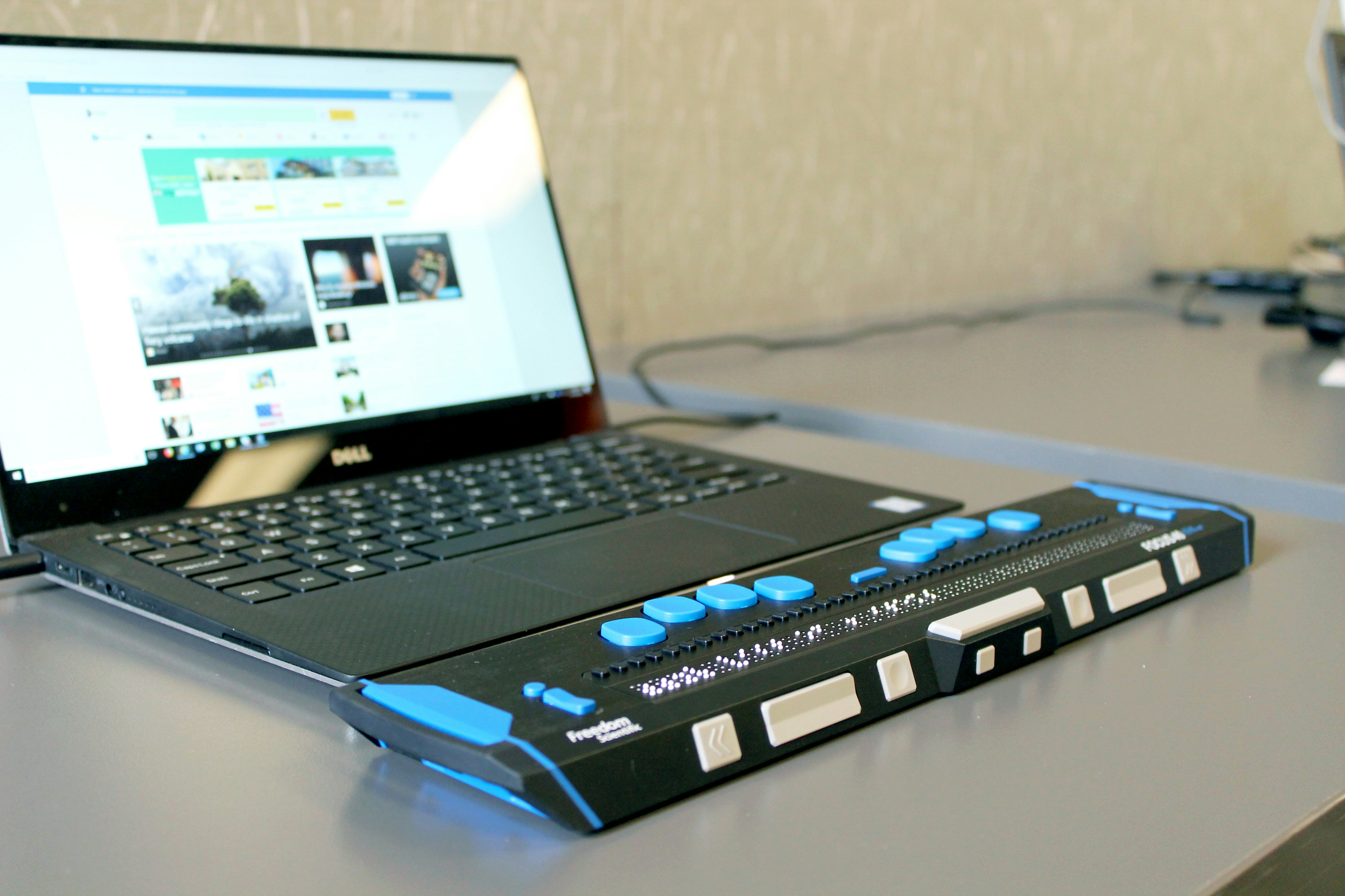
WCAG 2.2 is not about accessibility experts
It is about everyone else.
When people hear accessibility, they often imagine complex regulations, expensive audits and endless checklists. In reality, most websites fail because of surprisingly small things.
Buttons that are difficult to click.
Keyboard focus that disappears completely.
Drag-and-drop interactions that have no alternative.
Login flows that force users to remember information they shouldn't have to remember.
None of these problems sound dramatic.
Until you are the person affected by them.
WCAG 2.2 was created to address exactly these kinds of issues. Not theoretical edge cases. Real-world barriers that prevent people from using digital products.
And the uncomfortable truth is:
Most teams don't have a big accessibility problem. They have hundreds of tiny ones.
The invisible focus problem
Let's start with one of the most common mistakes.
You open a website and press the Tab key.
Suddenly you have no idea where you are.
Many design systems either remove the browser's default focus style or replace it with something so subtle that nobody can actually see it.
Designers often do it because the default outline feels "ugly".
Developers often inherit it from component libraries.
Nobody notices because most people use a mouse.
WCAG 2.2 notices.
The new Focus Appearance requirements raise the bar significantly. Keyboard users must be able to clearly identify where they currently are.
Not somewhere.
Not maybe.
Clearly.
A beautiful interface that becomes unusable without a mouse is not a beautiful interface.
Small targets create big frustrations
We've all seen them.
Tiny icon buttons.
Minimalistic checkboxes.
Links squeezed into crowded navigation menus.
They look clean in Figma.
They are much less clean when someone tries to tap them on a moving train, with one hand, on a mobile device.
WCAG 2.2 introduces stronger requirements around target size because accessibility is not only about disability.
It is also about usability.
The same improvements that help someone with limited motor control help:
- Parents carrying a child
- People using older devices
- Users on crowded public transport
- Literally anyone with large fingers
Accessibility improvements often improve the experience for everyone.
That's why we rarely think of accessibility as a separate feature.
It's simply good product design.
Drag and drop is not enough anymore
Many modern products love drag and drop.
Kanban boards.
Calendar tools.
Dashboard builders.
File uploads.
The interaction feels intuitive.
Unless you cannot use it.
WCAG 2.2 strengthens requirements around dragging movements. If an action requires dragging, there should be another way to achieve the same result.
Why?
Because not everyone can perform precise pointer movements.
The goal isn't to remove advanced interactions.
The goal is to ensure they are not the only option.
Good products provide flexibility.
Bad products provide obstacles.
The password problem nobody asked for
One of the most practical additions in WCAG 2.2 focuses on authentication.
Many systems still create unnecessary friction:
- Disabling password managers
- Forcing users to re-enter information repeatedly
- Using memory tests disguised as security
We've all experienced it.
The six-digit code.
The secret phrase.
The "please remember exactly what you entered three screens ago."
WCAG 2.2 pushes teams toward authentication flows that work with users instead of against them.
Password managers.
Passkeys.
Autofill.
Modern authentication methods.
Security and accessibility are not enemies.
They should be working together.
Accessibility is a product problem
This is where many organisations still get stuck.
Accessibility often becomes someone's side project.
A compliance task.
A checkbox.
A future sprint.
A problem for later.
But accessibility isn't a legal requirement that happens to affect products.
It's a product requirement.
Because every accessibility issue ultimately affects a user trying to achieve a goal.
Someone trying to buy.
Someone trying to learn.
Someone trying to book an appointment.
Someone trying to complete a task.
Accessibility is not about standards.
Accessibility is about people.
The standards simply help us remember that.
What we see most often
When we review websites and applications, we rarely discover huge catastrophic accessibility failures.
Instead, we find patterns:
- Missing or invisible focus states
- Insufficient colour contrast
- Tiny interactive elements
- Missing form labels
- Components that only work with a mouse
- Authentication flows that create unnecessary barriers
The good news?
Most of these issues are surprisingly easy to fix.
The bad news?
Most teams never look for them.
Start small. Start now.
You don't need a six-month accessibility transformation programme.
Start with three questions:
- Can every interactive element be reached and used with a keyboard?
- Can users clearly see where keyboard focus currently is?
- Can all important actions be completed without dragging, guessing or memorising information?
If the answer to any of those questions is "not sure", you already know where to begin.
Accessibility does not happen because a company writes it into a strategy deck.
Accessibility happens because teams care enough to notice the details.
And WCAG 2.2 is mostly about details.
The kind that users remember long after they forget your feature list.
At BitBitHooray, we believe accessibility is not a compliance exercise. It's part of building products that respect people's time, abilities and circumstances. Better accessibility usually leads to better products. And better products create better businesses.

ctaBanner.title ctaBanner.titleSecondary
ctaBanner.subtitle